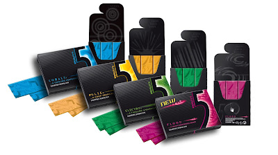
When trying to think about products that I buy specifically based on the design of the packaging I immediately thought about the gum I tend to buy. For whatever reason I am drawn to 5 gum, and I am pretty sure it has almost everything to do with how it is packaged. Honestly I am not a huge fan of the way it tastes or its texture.
When comparing these two brands of gum, you can see very distinct differences in the designs of the packages. I would argue that both packages have good qualities in them. There is nothing wrong with the Winterfresh package, however the 5 gum brand clearly has a more artistic and high end design. In doing a little research I found that the Winterfresh brand gum sold far less product then the 5 gum did in past years. Based on my own personal opinion I am led to believe that that is due to the brands unique design.
The 5 gum has always had the "cool" factor associated with its brand. Over the past years since this brand was developed there have been a number of commercials that have promoted that idea. The packaging holds true to that persona. From the sleek black paper case that holds the individual pieces of gum, to the individually and colorfully wrapped sticks themselves. The case itself has different physical textures on it. You can feel some of the text is raised so that it stands out from the background. The flap has raised bumps that help you open and close it. There is a lot of negative space on the package as well, which gives it a very professional and "grown-up" look. The 5 on the outside of the case shows an example of the Gestalt closure principal, because our mind makes the 5 out from the figure that divides the color and the black. Inside, the individual sticks of gum are wrapped in a very bright foil. Something as well that stands out to me is how when you open the package the inside of the case is a more matted black as opposed to the shinier outside. This is significant because it adds to contrasting shiny wrapped sticks of gum. The over all feel of this design is almost like opening a a jewelry box, the jewel in this case being the 5 gum.
The Winterfresh design to me looks a little out dated, and very simple. It doesn't have nearly that same "cool" feel as the 5 gum. Its blue packaging however does fit the product. The icy blue color gives it a different cool feel. The Winterfresh design is definitely fitting for what it's selling. Its gum, its not anything fancy. Its only purpose is to be breath freshener, and its design sells that for sure. It's not trying to be anything more than what it is, but because of that people tend not to reach for it on the shelf.


No comments:
Post a Comment