Alex Ackermann COMM3560
Thursday, April 20, 2017
Artifact :30 Spot
Monday, February 6, 2017
Design Evaluation
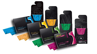
When trying to think about products that I buy specifically based on the design of the packaging I immediately thought about the gum I tend to buy. For whatever reason I am drawn to 5 gum, and I am pretty sure it has almost everything to do with how it is packaged. Honestly I am not a huge fan of the way it tastes or its texture.
When comparing these two brands of gum, you can see very distinct differences in the designs of the packages. I would argue that both packages have good qualities in them. There is nothing wrong with the Winterfresh package, however the 5 gum brand clearly has a more artistic and high end design. In doing a little research I found that the Winterfresh brand gum sold far less product then the 5 gum did in past years. Based on my own personal opinion I am led to believe that that is due to the brands unique design.
The 5 gum has always had the "cool" factor associated with its brand. Over the past years since this brand was developed there have been a number of commercials that have promoted that idea. The packaging holds true to that persona. From the sleek black paper case that holds the individual pieces of gum, to the individually and colorfully wrapped sticks themselves. The case itself has different physical textures on it. You can feel some of the text is raised so that it stands out from the background. The flap has raised bumps that help you open and close it. There is a lot of negative space on the package as well, which gives it a very professional and "grown-up" look. The 5 on the outside of the case shows an example of the Gestalt closure principal, because our mind makes the 5 out from the figure that divides the color and the black. Inside, the individual sticks of gum are wrapped in a very bright foil. Something as well that stands out to me is how when you open the package the inside of the case is a more matted black as opposed to the shinier outside. This is significant because it adds to contrasting shiny wrapped sticks of gum. The over all feel of this design is almost like opening a a jewelry box, the jewel in this case being the 5 gum.
The Winterfresh design to me looks a little out dated, and very simple. It doesn't have nearly that same "cool" feel as the 5 gum. Its blue packaging however does fit the product. The icy blue color gives it a different cool feel. The Winterfresh design is definitely fitting for what it's selling. Its gum, its not anything fancy. Its only purpose is to be breath freshener, and its design sells that for sure. It's not trying to be anything more than what it is, but because of that people tend not to reach for it on the shelf.
Wednesday, January 25, 2017
Contrast, Balance, Harmony
http://www.ejphoto.com/joshua_tree_page.htm
This picture is full of examples of contrast, from the extreme contrast between the silhouettes of the trees and the background of the sunset, to the contrast between the size and shapes of the trees. This is one the main reasons I chose this pictures over the others. The contrasts force the viewer to focus on the unique shape and natural design of the trees. These trees have a very distinct look, and removing their color and light while illuminating the outline with the soft glow the setting sun allows the eyes to fully appreciate their beauty.
One of the things about this picture that makes it so pleasing to look at is how balanced it is. You could almost cut the image down the middle from top to bottom and have the two haves be identical. Its rare to come across a Joshua tree that is symmetrical, most of these trees tend to be very lopsided and abstract in their appearance. This image takes these trees and lays them out in a way that feels balanced.
Texture is another important part of this picture. These trees are extremely rigid and rough. This is very easy to feel with the contrast of the dark branches against the blue and orange background. You can see the sharp spikes that cover this tree very easily this way.
The Gestalt principal says that an image has a figure and a ground. The figures in this image are the trees, the ground is the beautifully lit sky.
The color in this piece is absolutely breath taking to me. I spent many evenings in the California desert watching as the sun went down behind these beautiful trees. I didn't take this picture, but I have seen this scene so many times, and this picture captures it so perfectly.
Wednesday, January 18, 2017
Visceral Response
The majority of the space in this image is unoccupied. True negative space can be seen at the far right edge of the image as bottom of the light bulb fades into complete blackness. This allows for the focus of this picture to be the electrified tungsten filament. The filament being at the center of the image, and also being surrounded by they almost perfect circle created by the outside of the lightbulb, draws my eye right to it.
There is a tremendous amount of contrast in this picture as well. The outside edges are almost completely black. As my eye moves closer to the center the light becomes more and more intense until the very center appears to be completely white. This stark contrast adds a lot to the overall feel of the image. It almost gives me the feeling that the bulb is just barely beginning to light up, and the darkness is being pushed away. It is a very comforting feeling.
Subscribe to:
Posts (Atom)


